by Melanie Lindahl
Introduction
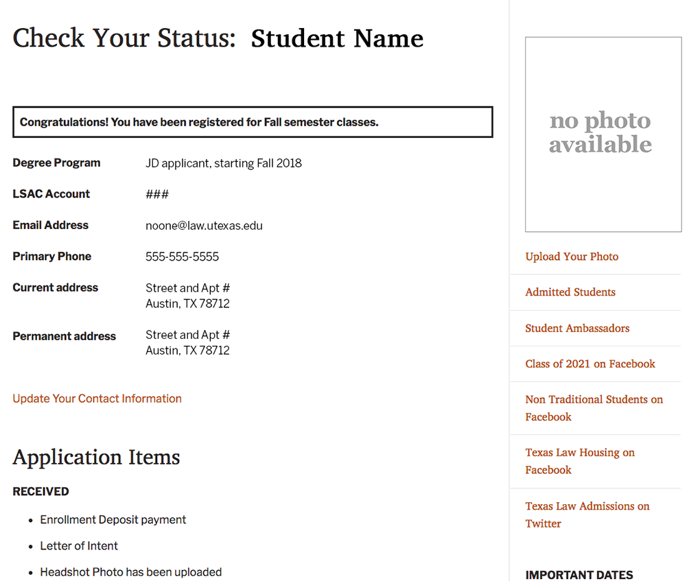
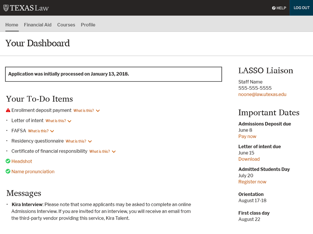
Since the early 2000’s, students admitted to Texas Law have had access to an internal Status Page where they could view their admission status, missing paperwork, and ultimately their class schedule. It was badly in need of updating
Our team spoke with first-year students to better understand their needs for an updated Status Page. We learned that they were frustrated, because once their status changed from “admitted” to “current” students, they could no longer access their class schedules on the Status Page.
Our team realized this was a valuable opportunity to bridge the admitted student experience with the current student experience.
The old Status Page code needed an overhaul and updated look.
Bringing Past Research to Life
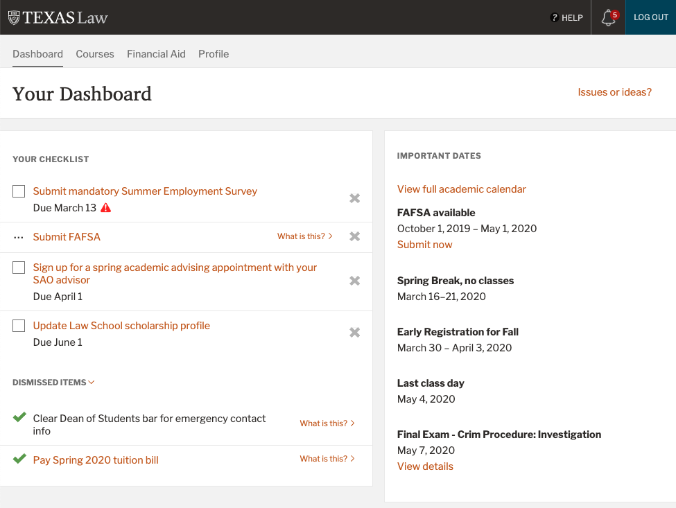
From previous research with current students, we knew that they also wanted a comprehensive resource that combined course information, academic deadlines, events, and more. We realized that organizing this content into an application, one which could also serve as a new Status Page, would meet both needs.
We called this new application the Dashboard.
Past student research project
Left: Card sorting into buckets | Right: Ideation workshop activity
Problems solved with the Dashboard
- One central location for students to find important and frequently sought information
- Individualized content catered toward each student’s experience
- A bridge to ease the transition from “admitted” students to “current” students
- A direct communication tool which allows the law school to share highly important items with students
Where to begin?
A fairly daunting application to research and build, the Dashboard project was divided into two phases:
- First, Admitted student access.
- And second, Current student access.
Since admitted students needed the new application delivered first, we began work in August 2018 before the bulk of the admission cycle.
Admitted Student Dashboard
- We spoke to first-year students a few weeks after school started about their experiences with the old Status Page and how it compared to other schools to which they were admitted. We were pleasantly surprised when students said our old system was still better than most other law schools.
- We designed the interface and conducted in-person surveys for feedback in October.
- A month later, first-year students tested an interactive prototype.
- The new application was released into production in December 2018.
- In September 2019, we conducted a survey with the next crop of first-year students to gain feedback on how their admission process went with the Dashboard. Most all users found it helpful to varying degrees.
The first design of the new Dashboard was delivered to admission applicants.
Current Student Dashboard
Coming off of an intense first-phase lifecycle in early 2019, we began gathering requirements for the second phase, current student access.
Initial Requirements Gathering with Current Students
- First, we researched internal student web pages and applications to find yearly visitation patterns and popular content.
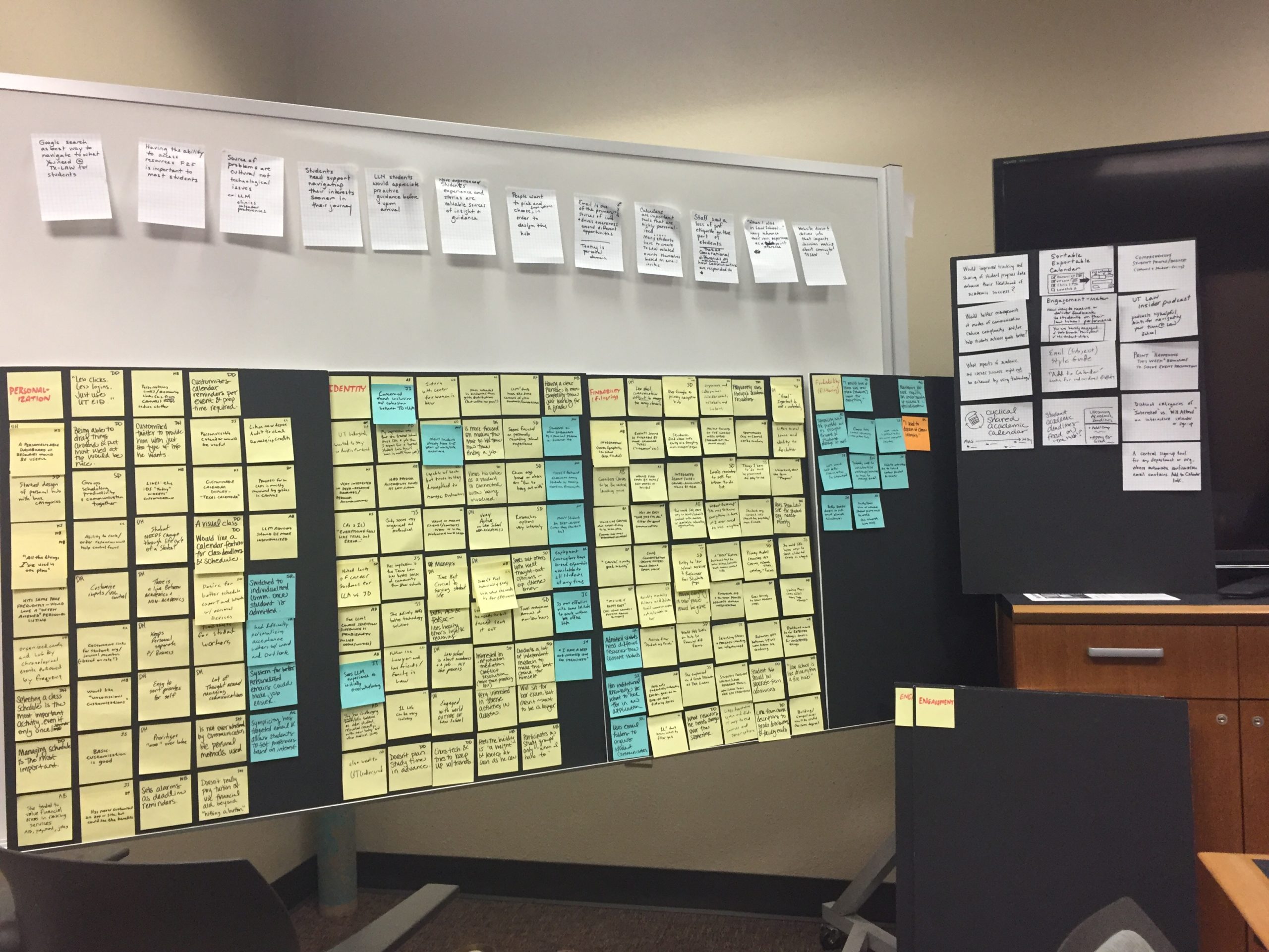
- We conducted our first round of discussions with current students in February 2019 through our regular “donut = quick chat” table in our atrium. We spoke to 25 students in different stages of their law school career. To learn which problems this Dashboard could solve, we asked students:
- What were their pain points in law school?
- Which information was difficult to find or use?
- Which personalized information would be useful to them?
- Our findings were categorized, and two main groups emerged:
- Course information (class schedules, course info, exam info, textbooks, and more)
- Calendar and events (academic calendar, upcoming events, and more)
Student Interviews
In March 2019, we created discussion points from our atrium talks to conduct one-on-one student interviews. We spoke to 11 students about their thoughts on:
- The idea of a to-do checklist that could be individualized to each student.
- The information they would need regarding their courses.
- Registration and ways to improve the process.
- Financial and non-financial bars that prevent students from registering.
- Ways the Dashboard could help with events and calendaring.
- Student resources.
- The one thing that would make their law school lives easier.
Each student conducted a card sort to identify which areas of interest were more important and less important to them. We found that the importance for each card depended on which year of law school the student was currently experiencing.
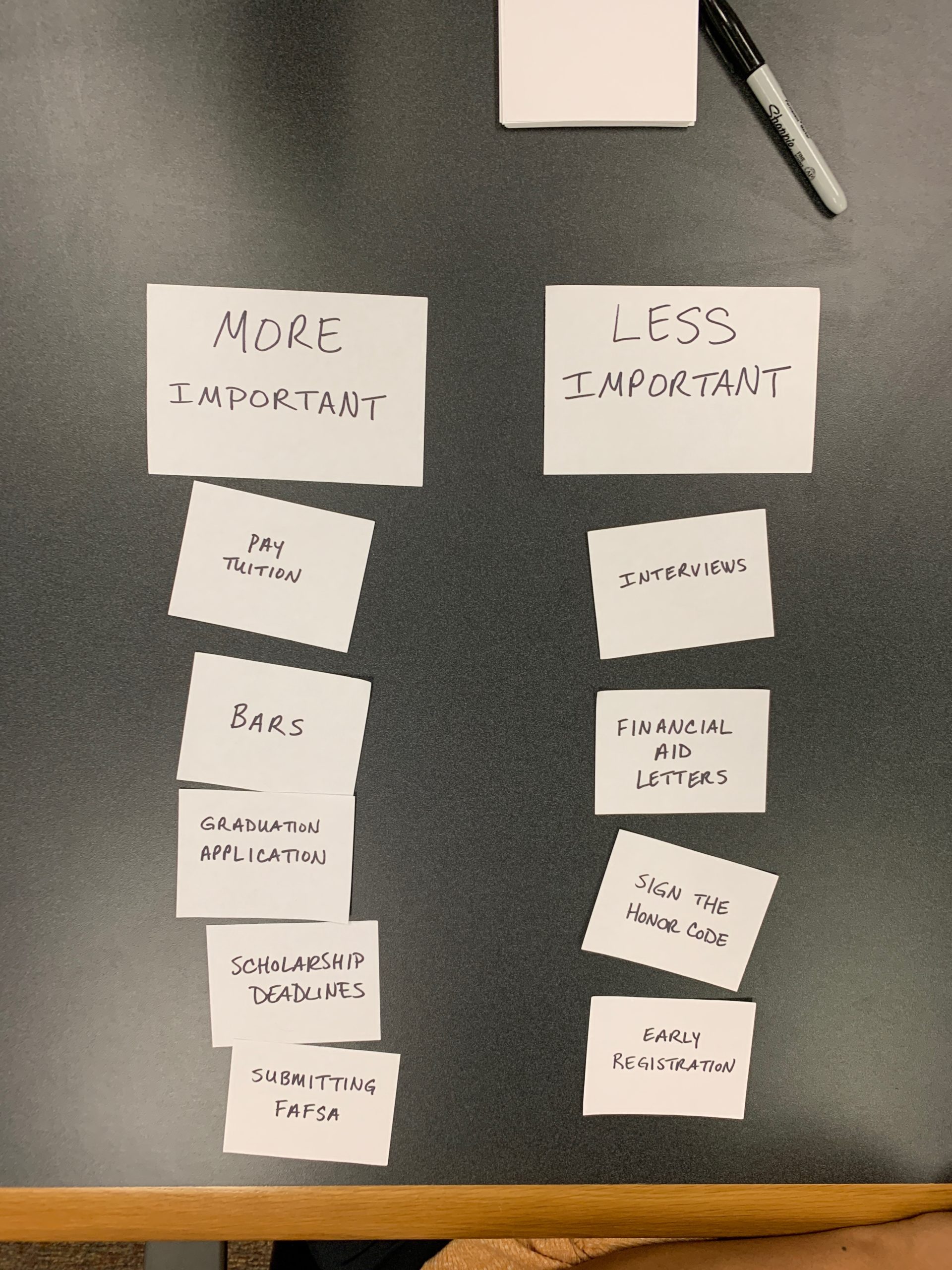
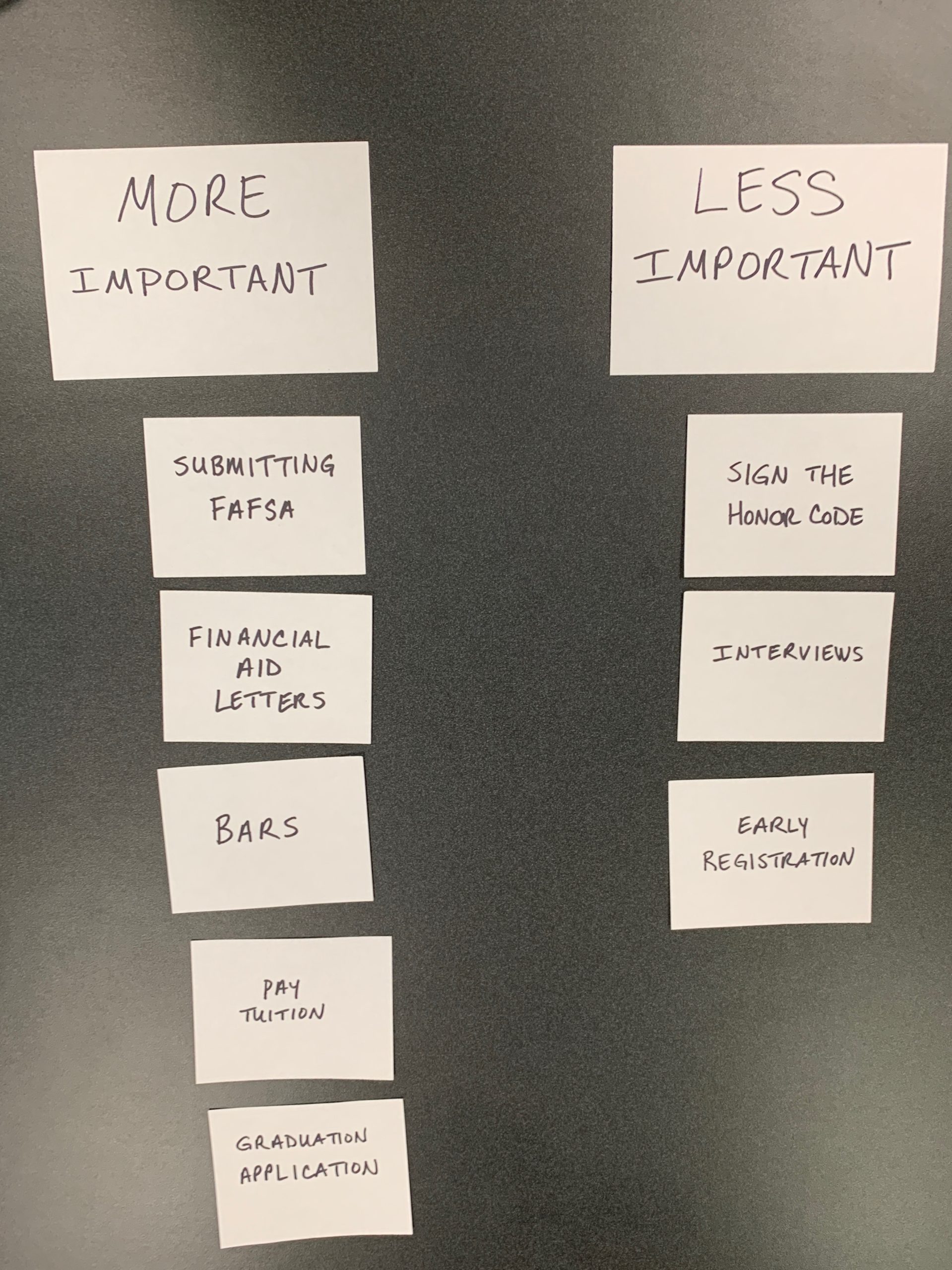
Card sort results from two student interviews
Components
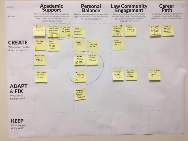
We studied the data collected during the student interviews to find commonalities and patterns. That analysis helped us determine the components and content needed for the Dashboard.
We grouped the components into four “views”:
- Dashboard (Home): To-Do checklist, important dates
- Courses: Class schedule, class and exam information, grades, hours, and GPA
- Financial Aid: Scholarship and loan amounts, out of pocket costs
- Profile: Personal information, name pronunciation
Design Challenges
The Courses view and the To-Do Checklist produced specific design challenges we needed to test separately.
Courses View
A hefty amount of information needed to be displayed on the Courses view:
- Current class schedule, which contained:
- Meeting days, times, and room locations
- Professors, textbooks
- Exam information
- And more
- Past classes
- Professors
- Credit hours and grades
- Semester and cumulative hours and GPA
The design for the Courses view needed to group this information in a usable way that wasn’t overwhelming.
In April 2019, we conducted a round of informal user testing for the Courses view. We tested 34 students, and, thankfully, our design was usable to most everyone.
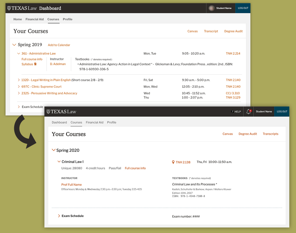
Top: Design used during testing
Bottom: Updated design based on feedback
We did learn of a few desires that students had, such as adding course credit hours and professors’ office hours.
To-Do Checklist
The Checklist interface proved to be the most challenging component to design. Early on, our team decided to use icons to mimic popular design patterns for checklist applications (completed, incomplete, upcoming due date, etc.). Ultimately, icons became our adversaries since some conditions didn’t have design patterns.
Our data could determine when some checklist items were completed (e.g., when a student paid their tuition). The system could auto-mark those items as complete once a condition had been met.
For the other checklist items that the system could not determine a completed state, students themselves would need to manually mark the item as complete.
In May 2019, we conducted informal remote user testing for the Checklist component. The vast majority of student users understood the interface after a bit of exploration.
Checklist testing module
Demo Testing
In July 2019, we conducted formal user testing on our beta application. We tested 15 students on their own devices with their own data. We gathered lots of good feedback, and the Courses view and Checklist were well-received. Some users still had an issue with one of the Checklist icons; however, we needed to move forward.
Launch and Adoption
In August 2019, before the Fall semester began, we launched the Dashboard for current students.
We anticipated a 45% adoption rate for current students by May 2020. We were unsure if third-year students would use a new tool during their last year of law school.
To our surprise, we saw a 91% adoption rate within one month after the launch for current students, which was astounding. While third-year law students did have the lowest adoption rate, 85% of that population still used the system.
Continual Refinement
Our team has made many updates to the Dashboard system, such as more individualized information shown to students, subtle modifications to the layout, and enhanced functionality.
We conducted a user survey in December 2019 to learn students’ preferences for how Checklist items are deleted and archived. This upgrade was implemented before the Spring 2020 semester began.
Epilogue
The Dashboard has become an extendable platform for consistently delivering information to all our students, enabling a more cohesive law school experience from admission application to graduation.