by Melanie Lindahl
Introduction
The filter panel for the existing Texas Law class schedule needed improvement. Many course features were shoved into one filter type, and the search results didn’t seem as useful as they could be. The layout was hard on the eyes and didn’t scale to mobile sizes well.
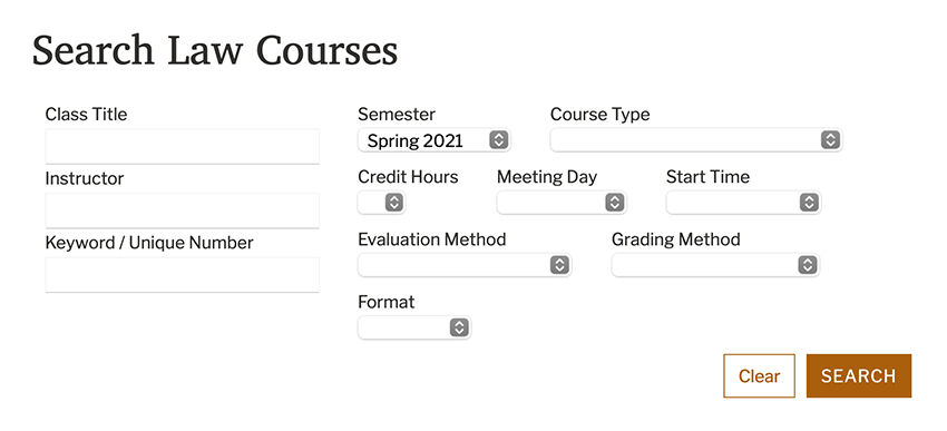
Previous version of the Texas Law class filter panel
Initial Research
While talking with students during one-on-one interviews, our team learned of certain drawbacks when using the class search and reaffirmed some suspicions:
- The Course Type filter was too restrictive. It only allowed students to filter by one of many course modifiers (such as Short Course, Clinic, and Upper-division) at a time.
- Students wanted a prominent Pass/Fail filter, which was currently under Grading Method.
- If a class had a final exam, students wanted to see the exam date in the search results rather than clicking through to the class detail page.
- When students used the back button to return to the search results page, the filters didn’t persist. This forced students to re-apply their filters.
- The class description in the search results only displayed a limited number of characters. Students wanted to read the whole description in the search results rather than clicking through to the class detail page.
- Second and third-year students didn’t want to see the first-year classes in the results.
- Search results weren’t sortable,
- … and they weren’t very usable on mobile devices.
Expanding the Filter Panel
To better accommodate the need for more filtering options, our team dismantled the existing structure to see how best to group the filters. Results of that rebuild included:
- The Course Type filter should house actual types of courses and not attributes of courses.
- E.g., A seminar class can be a short course or be cross-listed. The class at its core, however, is a seminar. Therefore, Course Type can filter by seminars, clinics, and internships.
- Attributes of a class, such as cross-listed, should become their own filter known as Features.
- Rather than having filters for all class start times, start times should be grouped into morning, afternoon, and evening.
- Similarly, law classes can have anywhere between 1-8 credit hours. More common hours, however, are 1-4. Credit hours higher than four should be grouped as 5+.
- An exclusion filter should be available to allow users to filter out first-year classes along with a few other types of classes students indicated during our research.
One issue to still fix: The right-most dropdown panel hangs off the browser window.
Simplifying Search Inputs
During user interviews, three different search types were mentioned: Class Title, Instructor, and Keyword (which searches for everything). Having three separate input fields seemed excessive, especially since students normally searched by class title and occasionally by instructor. Therefore, we utilized one search field where the user can change the search type much like Amazon’s current search field.
Applied Filters
Easily removing filters was one of our goals with the new class search. Rather than requiring users to re-open a dropdown panel to uncheck a filter, we decided to go with an e-commerce approach: having an applied filters section where users could simply click on the filter to remove it.
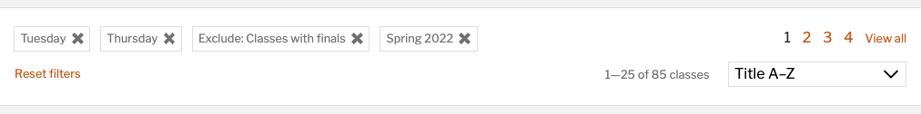
Applied filters section with a reset link
Using Vue for Quicker Search Results
A big component of this project was displaying quicker search results. We implemented Vue.js since it provided us with the tools we need for better, faster, more reliable interactivity and quicker development.
When users apply a filter, the results begin loading after a brief but purposeful delay. When users continue to add or remove filters, the query continues pulling data seamlessly and displaying those results.
More Content within Search Results
To house all the information students wanted in the search results, we implemented an accordion panel for each class. This allowed us to display the entire class description.

XD Prototype for Student Feedback
Once we felt the class search was ready for student feedback, we created an Adobe XD prototype that allowed students to play around with the filter dropdown panels. We sent students a survey with the prototype that asked various usability questions.
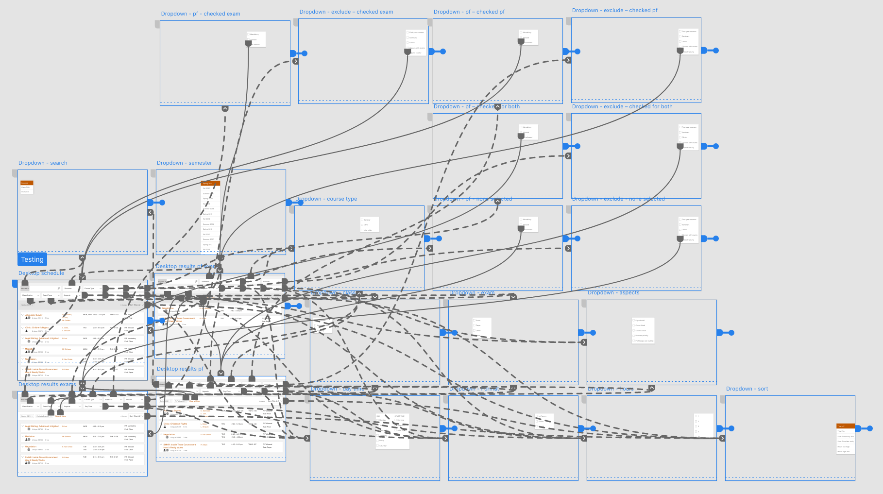
Wires connecting the filter options to their respective dropdown panel overlays in Adobe XD.
Impressively, 99% students surveyed found the new filter panel to be understandable.
We also asked the students which filters they felt they would use the most. Those answers helped determine in which order filters and their options were placed.
View All or Paged Results
We polled our students for their preference on viewing all search results versus viewing paged results. Most students preferred scrolling through all results. However, returning all results for each and every filtering choice took far too long to load. We settled on displaying 25 results and allowing users to click View all, which persists when they continue filtering or return to the results page using the back button.
Issues after Launch
We launched the new class schedule, and the next morning the system couldn’t handle the heavy student traffic. Result? All our sites and applications went down.
We reverted the class search to the old version for the approaching registration period since students would need reliable access to it over the next few weeks.
After weeks of testing, it became clear that our server was bogged down because our main query was too large and couldn’t keep up with the many requests being submitted.
Reworking for Better Results
After optimizing the code while working with our IT server folks, we launched again; this time, to success. We trimmed down the load time considerably by separating our queries to make them smaller.
We then moved on to building our favoriting system.