by Melanie Lindahl
Introduction
For years, we heard students say that they wanted an easy way to visually see proposed class schedules before registration occurred. “View classes in a weekly time block grid” was the top feature students selected in our initial student survey for the Early Registration project.
Students had all kinds of methods to create these visual displays: Excel documents, Google Calendar, many open browser tabs, and handwritten charts. While our dev team refined the new class schedule filter panel, we ascertained what a weekly grid meant and how it could be accomplished.
Student Requirements
From our one-on-one interviews with students, we determined the following aspects for a weekly time grid:
- Display a separate grid for finals, which would need a different design, as it spans two consecutive weeks
- Display time conflicts visually and textually
- Display a list view of classes in the grid
- Add classes to the grid from a favorites list
- Display a favorites sidebar
- Allow students to build multiple schedules, and should we let students rename schedules?
- Push classes from the grid to the Early Registration system (we decided to pull classes from a planned schedule to the Early Registration system instead)
- Display a warning about cross-campus classes? Warn students about closely-timed classes that are in non-law buildings. We determined this wasn’t possible because classrooms aren’t assigned until after registration.
Dodging Assumptions on User Behavior
We didn’t want to assume users would take the same path when using this planning tool. We saw a natural progression for students to start with the class schedule, mark some favorites (or not), build a proposed schedule, then submit their registration.
What if a student didn’t use favorites or even the class schedule when building a proposed schedule?
We decided students should be able to create a proposed schedule using class titles, instructors, unique numbers, or choose from their favorites. That way, students didn’t need to follow a particular journey to use the tool.
Designing a Complicated Layout
Texas Law class times are … wonky. Here are some fun ones:
- 9:10–10:17 a.m.
- 2:15–3:22 p.m.
- 3:45–6:55 p.m. (hey, at least this one is on a five-minute mark!)
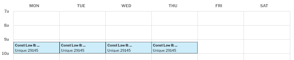
How to design a grid to display class times for each day of the week broken down into minute increments? Using 15 or even 10-minute increments wouldn’t suffice, as class times would appear to overlap when they actually didn’t.
We opted for five-minute increments per hour while only visually displaying hour increments to avoid visual clutter. Therefore, we used CSS Grid to create 180 rows (15 hour blocks divided into five-minute increments).
Our CSS Grid had five-minute increments so strange class times wouldn’t cause incorrect time conflicts.
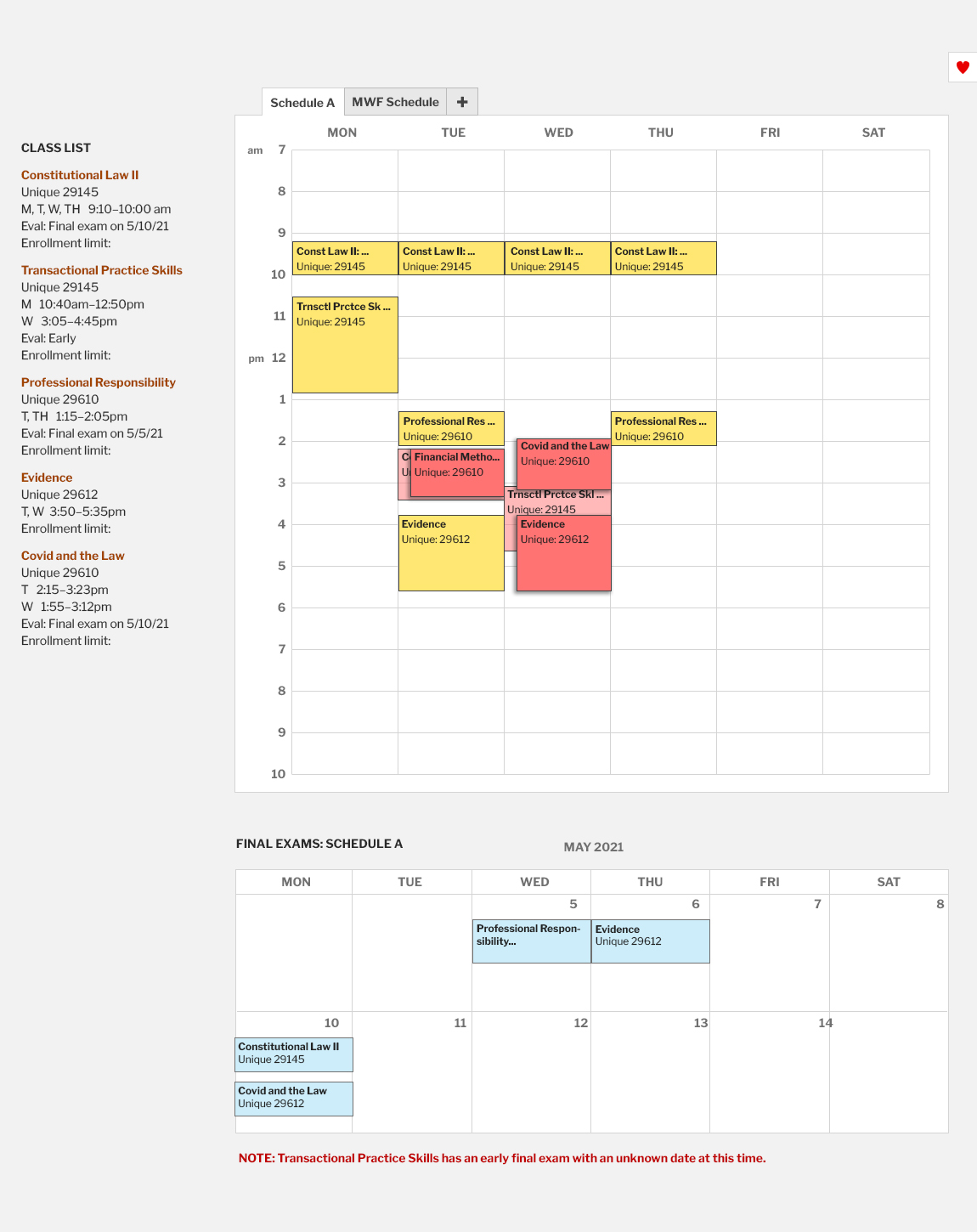
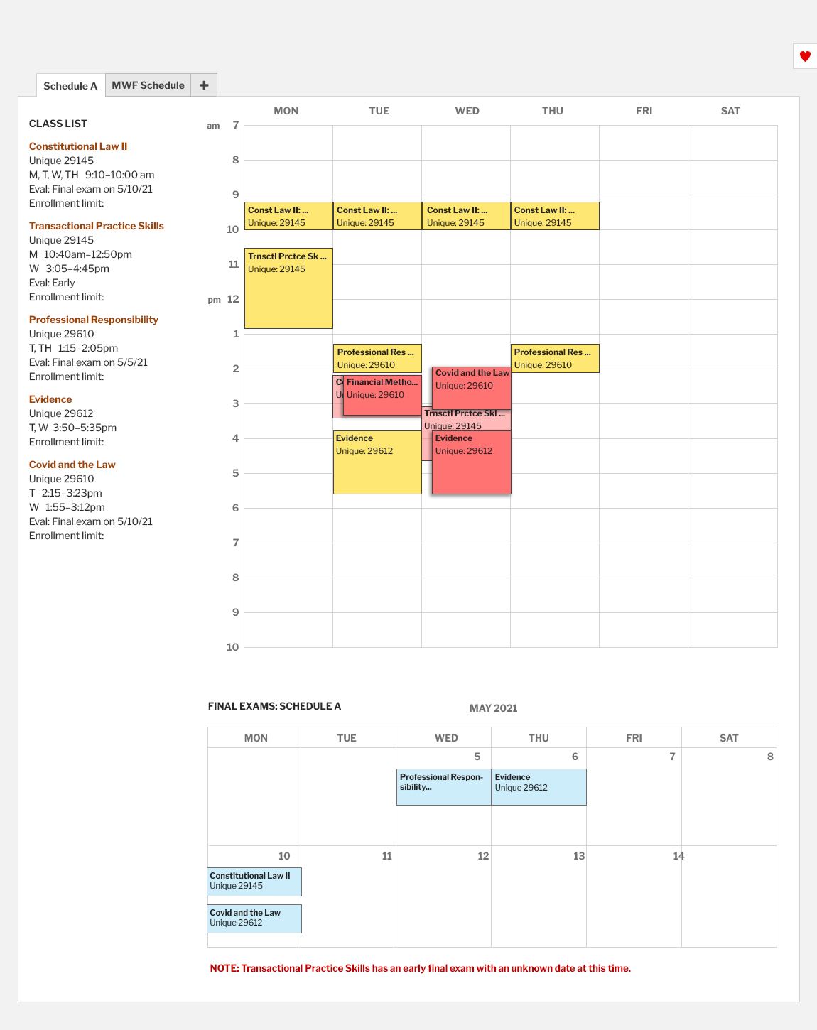
Class Details
Having a visual calendar grid is good and all, but only a small amount of information can be displayed in the grid (as shown above). Our team used modals to display important class information, such as:
- Time conflict warnings
- Exam information
- Class times
- Other information students indicated they used to make registration decisions
We also added a way to remove a class from the grid through the modal.
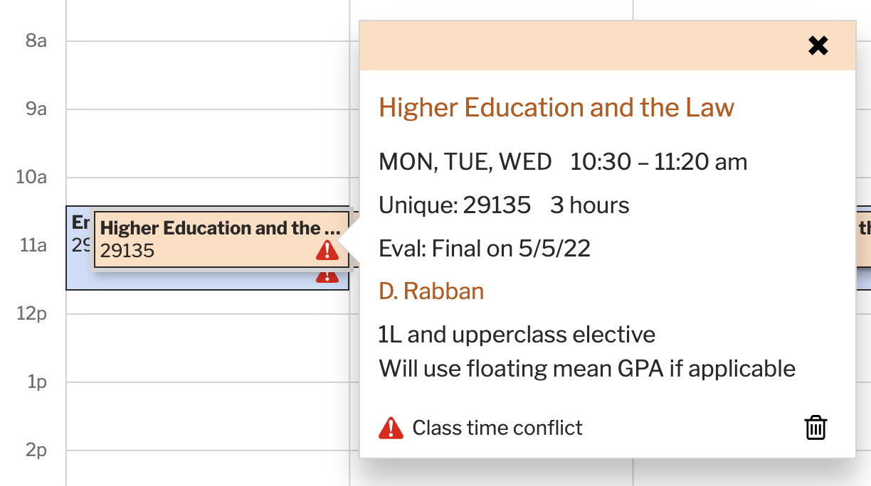
A popup window detailing class information appears when a class is clicked in the grid.
Overlapping Class Times
Due to horizontal space constraints within each day column, we needed to limit the number of classes that occupied any five-minute interval. We found a maximum of three overlapping class times to be the sweet spot, as that still allowed enough space to see individual class titles hiding under overlapping ones.
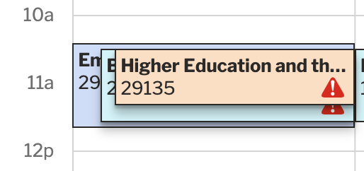
Courses taught at the same time of day are layered.
Short Courses and Time Conflicts
Texas Law offers short course classes that don’t span the entire semester. In fact, these classes might only be held over one weekend.
Since short courses could overlap with other short courses in the weekly time grid, that doesn’t mean their class dates conflict. Some of these short courses might be taught months apart.
In the example below, you can see these two short courses do not have a time conflict since they are taught on different dates.
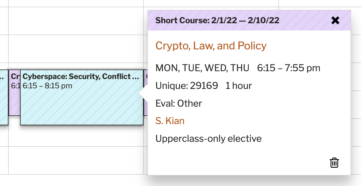
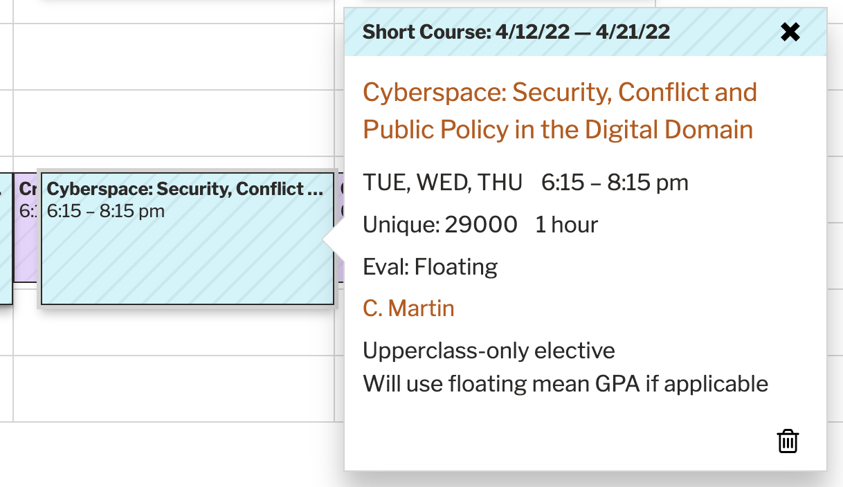
Two short courses that don’t conflict even though they are taught at the same time and day of the week.
To help resolve confusion around short courses, we:
- used a striped background to indicate a short course in the grid.
- added the short course dates to the top of the modal.
Multiple Schedules
Students indicated they would need to plan different versions for their schedule. Therefore, we added a way to create up to three schedules (per initial student feedback) and a way to rename them.
Favorites
Adding courses to a schedule from a student’s favorites seemed like a win for usability. We added a slide-out drawer to quickly add favorites.
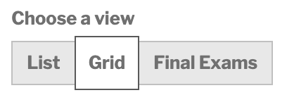
Different Views
To accommodate varied student preferences on how to view a proposed schedule, we needed to include the following views:
- Visual weekly grid
- List of classes
- Final exam calendar
Do we display all three views at one glance or do we break them out so users focus on one at a time?
Here were a few layouts we tinkered with:
We ultimately decided to break out the different views to maximize space and reduce visual clutter. We designed a view switch in the upper-right corner of an individual schedule.
Final Exam View
The view for final exams required a calendar view opposed to the weekly grid view.
Additionally, Texas Law doesn’t recommend multiple final exams on the same day or on three consecutive days; therefore, we added a warning if the student planned a schedule under these circumstances.
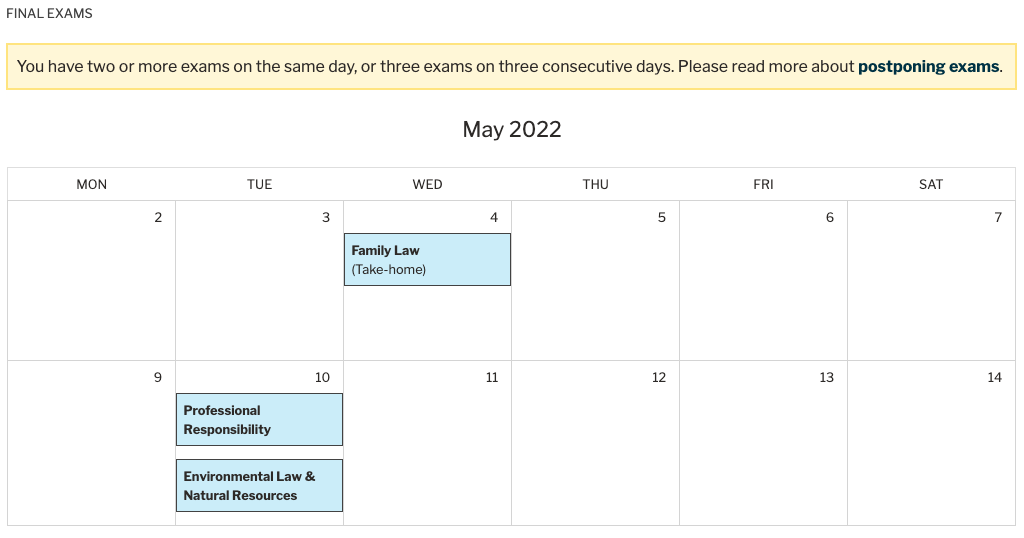
The final exam view needed a two-week calendar instead of a weekly breakdown.
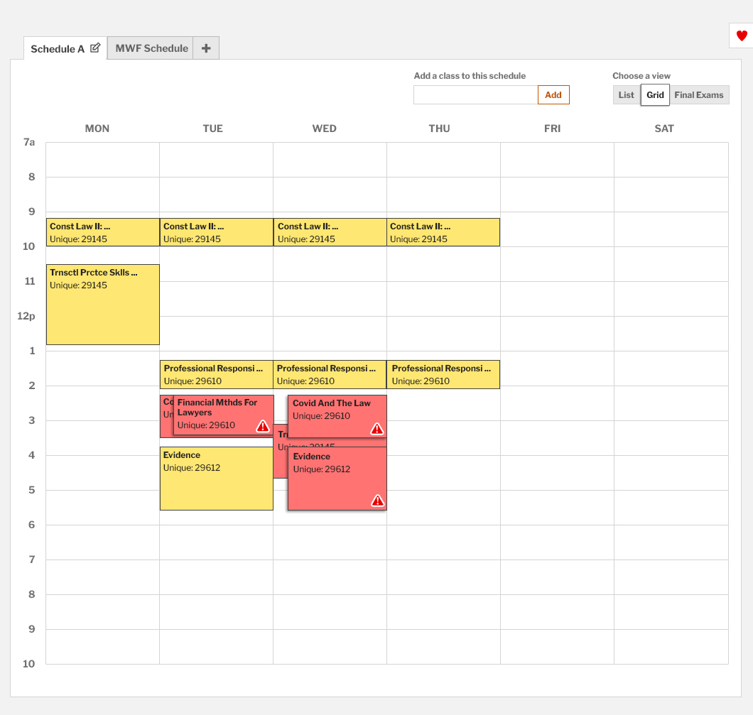
List view
No design work was necessary for the list view – happy days! We decided to simply implement the same layout as the main class schedule. We did include, however, warning icons that indicated if classes conflicted with each other.
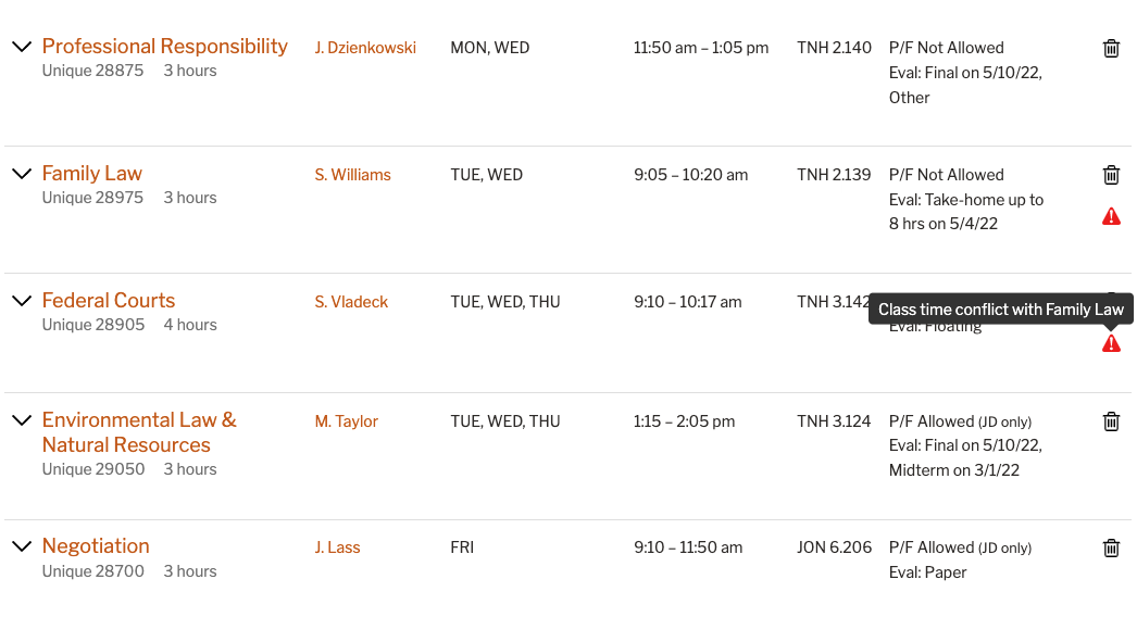
The list view provides the most class information.
User Testing
Students grasped the Schedule Planner and its features very well. They understood time conflicts, short courses, the different views, adding favorites, and building multiple schedules.
A student testing the Schedule Planner.
Failings of the Interface
Two issues surfaced during testing:
- Deleting a schedule was not very intuitive.
- Autocomplete in Chrome displayed a confusing arrow.
Deleting a Schedule
Originally, we placed the delete function at the bottom of the screen where we felt students would look for it the most. While students were able to find it when prompted to delete a schedule, most students went to the schedule name area first.
The placement to delete a schedule was not immediately intuitive.
We solved this issue by moving the delete function to the schedule name area.
Fix: Place the delete function where students looked for it most.
Dropdown Arrow in Autocomplete Widget
User testing surfaced an issue specific to the Chrome browser with our autocomplete widget. A dropdown arrow appeared, causing students to believe they must select from a list of predefined choices in a list. After a few testing sessions with this arrow causing issues, our dev team fixed it in between sessions. Students performed well after the fix.
We have a great team for on-the-fly fixes that can result in ad hoc A/B testing!
Removing the default arrow in Chrome provided a smoother experience for students.
Testing Results
- Professor names and class times are more needed than unique numbers in the interface. We made this change.
- Students easily understood the warning icon’s meaning (class time conflict).
- Students easily understood the striped designation for short courses.
- The Delete Schedule link at the bottom of the page failed to inform students how to delete a schedule. We moved the delete function to where students looked for it most.
- Adding a semester heading to the schedule builder could help students understand for which semester they are building. We made this change.
- Students would more than likely build multiple schedules for the upcoming semester; however, a five-schedule maximum seems excessive. We increased the maximum amount of schedules from three to five based on post-launch feedback.
- Renaming schedules was somewhat important to students.
- Duplicating a schedule was somewhat important to students.
- Copying a class from one schedule to another was not as important to students.
- Swapping class layers in the grid view was not important to students.
A student providing useful feedback during testing.
Naming Things is Always Difficult
We originally labeled this tool the Schedule Builder. However, after speaking with our Student Affairs Office, we realized students might be misled that they are building a registration schedule (i.e., registering for classes). Therefore, we changed the name to Schedule Planner.
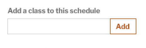
Additionally, the input field where students can type a class title, instructor name, or unique number had the label “Add a class to this schedule.” Upon further discussion, students might perceive “adding a planned class” as adding a class to their registration. We opted for “Include a class on this schedule” instead.
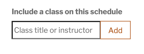
One small fix based on discussions with our Student Affairs Office.
Post Launch Feedback
We sent out a student survey after Early Registration ended in Fall 2021.
One insight from the survey was that students wanted more than three schedules (which contradicted our testing sessions). We increased the maximum amount of schedules to five.
Final Thoughts
The Schedule Planner was a very fun, engaging, and challenging project. Our team learned new skills along the way, and students really enjoy using it.
“Early registration was so much smoother and less anxiety filled because of the schedule planner. That tool is genius!”
2L student
A win for everyone.