by Melanie Lindahl
Introduction
Students used multiple different techniques to track classes that interested them. All of these approaches were cumbersome and required a lot of extra work from the student. During the Early Registration project, we decided to focus on this specific issue to alleviate the inconvenience.
Initial Research
Students shared very similar stories about how they prepped for Early Registration.
- Review the recently published online class schedule.
- For any class that sounds interesting, make new a browser tab. Some students preferred to write or copy and paste the information manually.
- Review the interesting classes more carefully, then decide on a handful for registration.
- Create a weekly time grid, either through Excel or Google Calendar, to illustrate the daily schedule for the handful of classes.
One piece of feedback the students repeatedly shared was the sheer number of browser tabs they had to keep open for weeks at a time. This bit of information really stuck with us while we determined features for our overarching Early Registration project.
“Would be useful to have a way to leave notes to yourself about your favorite classes and why they were selected.”
3L Student
Cribbing from E-commerce
While discussing ways to mimic an online shopping experience for Early Registration, one aspect of e-commerce user experience design seemed very appealing: favoriting.
Favoriting could solve the issue of needing to manually keep track (through browser tabs or notes) of classes that seemed interesting. It could also provide the law school with data regarding preferred courses.
Access
We knew it would be best if students were logged in when they favorited a class, but we also wanted students who weren’t logged in to see that the functionality existed. We decided that however we chose to illustrate the favoriting mechanism, we wanted to display it to all users — even if they weren’t affiliated with our law school. Showing prospective students a little piece of our overall student experience would also be helpful.
We concluded that only current law students should be able to favorite classes. If the user was logged in, we would know if they were a current law student.
A Repository
Next, our team had to figure out where to house a student’s favorites. Favorites were related to classes, but the class schedule didn’t seem suitable for housing individuals’ favorites. Ultimately, we decided to store favorites in the Student Dashboard since their class schedules were already kept there.
We concluded that if data identified with the student, it should live in the Dashboard. Favorites belonged to each individual student.
Therefore, we knew we needed to create a landing page or “hub” for favorites to live inside the Dashboard.
Iconography
After reviewing many e-commerce sites, we opted to display a heart icon for the favoriting functionality. We knew we’d need to design various states of the icon:
- Unselected
- Selected
- Hover
- Disabled state for users who weren’t logged in or weren’t a current law student.
Color Blindness
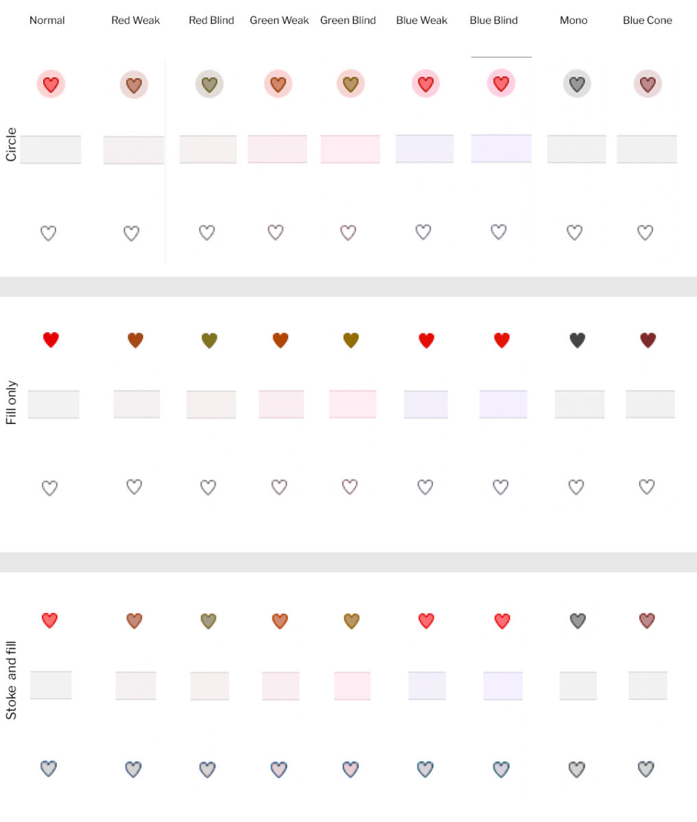
Before we finalized the icon design, we wanted to ensure each state of the heart was distinguishable from the others for color-blind users. Therefore, we ran design ideas for selected, unselected, and hover states through different color-blind filters.
From this testing, we determined that the “Circle” hover state and the “Fill only” selected state contrasted enough with the unselected state of a simple stroke with no fill. The “Stroke and fill” option didn’t provide enough contrast between a selected and unselected state.

Heart icon designs run through various color blindness filters to determine the contrast between selected and unselected icons.
Icon States
![]() Unselected – No fill, grey outline
Unselected – No fill, grey outline
![]() Selected – Red fill, red outline
Selected – Red fill, red outline
![]() Hover – Red fill, red outline, circular pink background
Hover – Red fill, red outline, circular pink background
Only triggered when heart is hovered, not when parent container is hovered
![]() Disabled – light grey fill, medium grey outline
Disabled – light grey fill, medium grey outline
Tooltips
An issue arose with the disabled icon where we needed to inform the user that they must log in to use the heart icon. We opted to display a custom tooltip using the Tippy.js library for certain icon states to provide additional context.
- Unselected (logged in only)
- Current Law students: “Add to your Favorites”
- Everyone else who is logged in (disabled state, see below)
- Selected (logged in only): “Remove from your Favorites”
- Disabled
- Logged out: “Law students can log in to add Favorites”
- Logged in for those who are not current Law students: “Only current Law students can add Favorites”
Placement on the Class Schedule
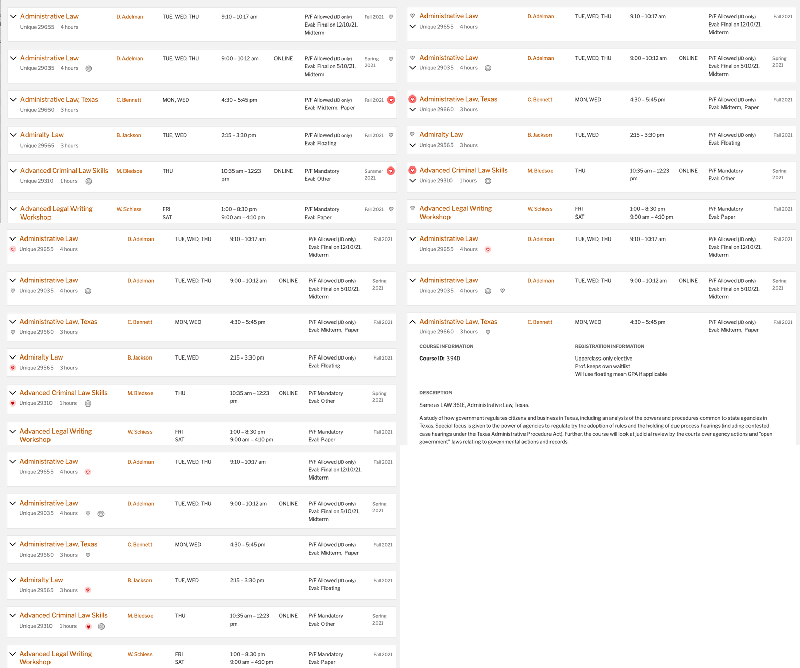
Finding a suitable place for the icon in the newly redesigned class schedule was a challenging but fun task. We went through many different iterations and landed on the heart icon being placed in the details below the class title for both mobile and desktop sizes.
To facilitate page scanning, the icons needed to align vertically. Therefore, we moved the data around a bit to create a cohesive look across each search result.

Finding a suitable place for the heart icon in the class schedule search results
Designing the Favoriting Hub
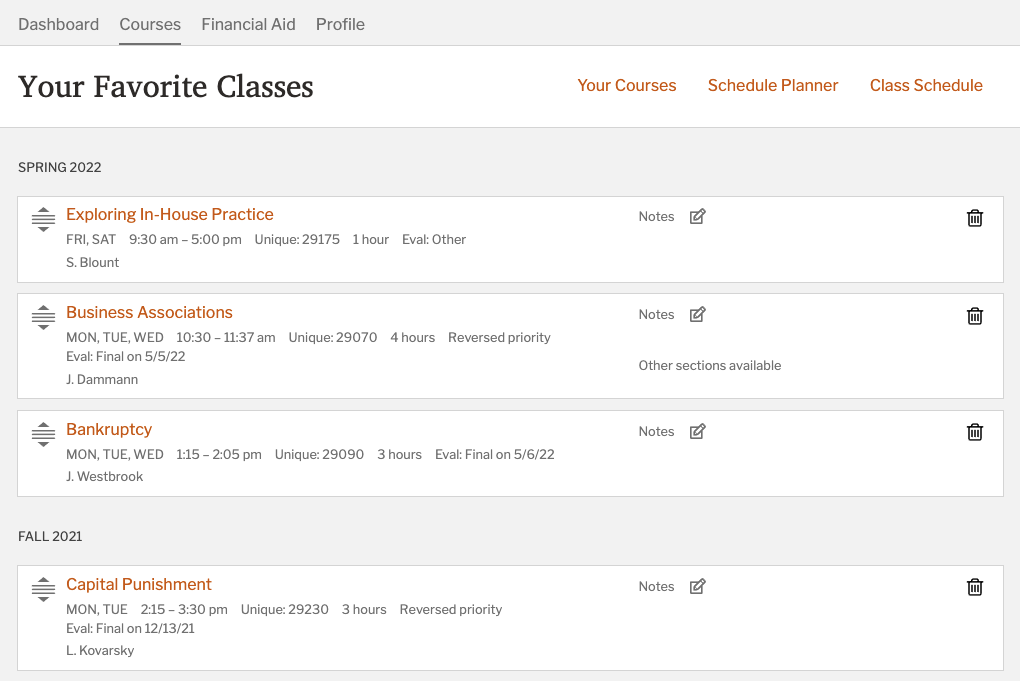
We already determined the need for a central place to review favorited classes. We opted to house Your Favorites under the Courses section of the Dashboard. During our interviews, students mentioned additional functionality that seemed logical to integrate into Your Favorites:
- Reordering classes manually
- Typing personal notes for each class
- Informing the student if the class is offered again in future semesters (not implemented to date).

Final design for Your Favorites
Testing
During testing, students breezed through our tasks even more intuitively than we hoped.
We did experience one minor hiccup. Students attempted to log in from the tooltip multiple times before achieving success. The tooltip simply wasn’t as persistent as the students needed it to be.
We solved this issue by keeping the tooltip open for longer. This allowed students to click the Log In link on the first attempt. Time on task to log in from the tooltip went from six seconds to two seconds once we implemented the fix.
Making the tooltip persist reduced the time on task from six to two seconds to log in from the tooltip.